Client

Rockridge Geotechnical

Year

2025

Deliverable

Brand Identity + Web Design

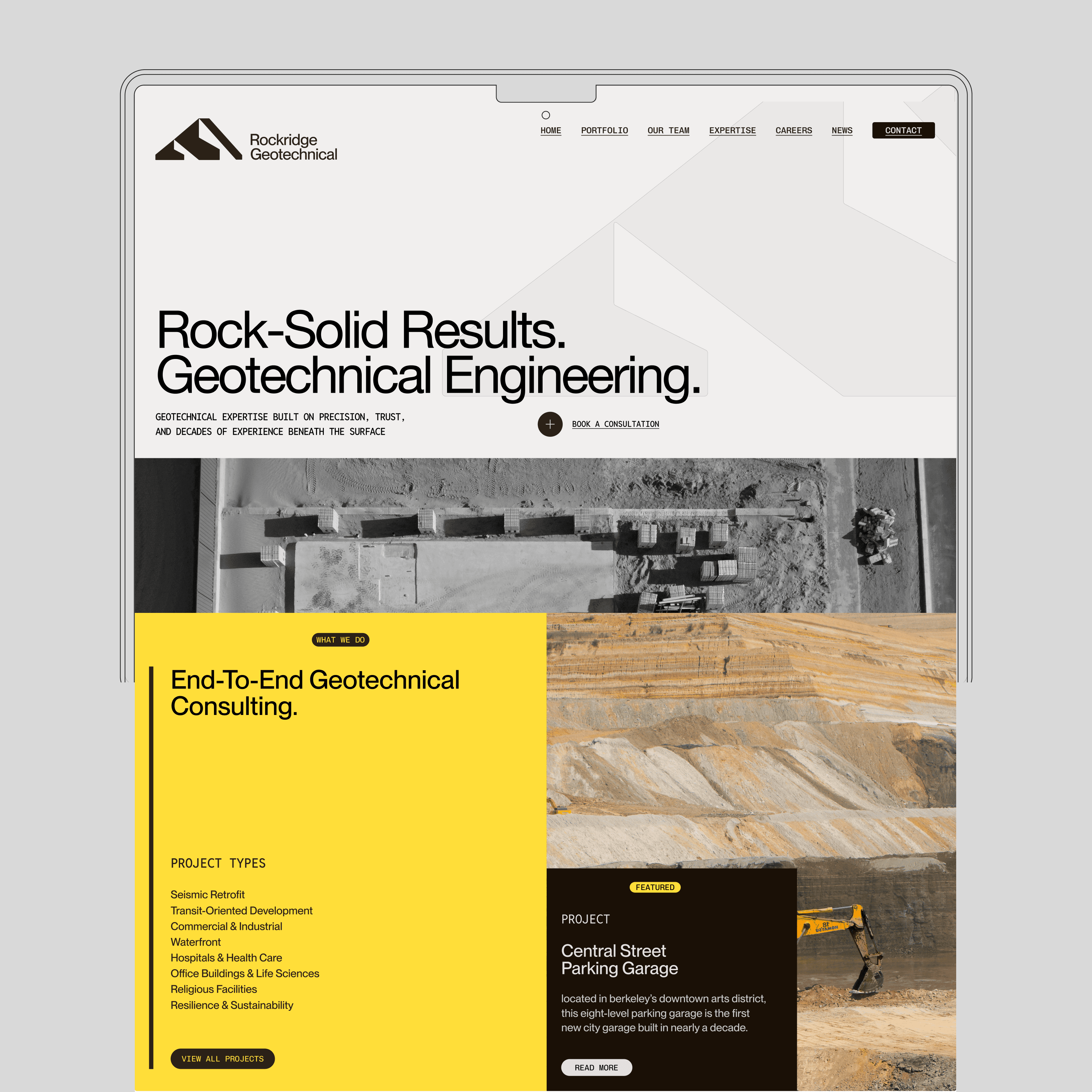
Rockridge Geotechnical’s identity hadn’t changed since 2006, and it showed. The firm’s legacy carried weight, but its visuals lagged behind; stuck in a dated, conservative aesthetic that didn’t reflect its precision or expertise. The challenge was to modernize without erasing heritage: to design a brand that feels intelligent, structural, and credible in a field dominated by older competitors, without drifting into trend or playfulness.

The new identity abstracts the geometry of mountains and retaining walls into bold, modular forms—visual metaphors for stability and elevation. The use of a bright, engineered yellow against deep graphite anchors the system in technical confidence, while a gridded layout introduces a sense of order and measurement. The typography, set in a clean grotesk, balances function with clarity. Across print and digital, the brand behaves like engineered infrastructure; precise, minimal, and built to last.

The logo is built from intersecting slopes that reference the ridgelines and engineered cuts seen in geotechnical work. It’s direct, geometric, and heavy; more structural than symbolic. The design focuses on balance and precision, creating a mark that feels grounded and confident without trying to be clever.

The web redesign modernizes Rockridge’s legacy through deliberate structure and restraint. The grid system mirrors the logic of engineering drawings, while generous spacing and precise typography convey technical confidence. The logo’s angular geometry is echoed subtly throughout the layout, creating visual consistency that reinforces the firm’s foundation-driven identity.

A limited palette of black, white, and construction yellow balances clarity with authority. High-contrast imagery grounds the design in real terrain, while clean vector forms bring in a sense of control and order. The site’s modular composition lets information feel solid yet adaptable, like the ground they build on.

Credit

Tonan Ahn

(Lead Designer)

Darcie Daffodil

(Project Manager)

Ian Keith

(Photographer)


The web redesign modernizes Rockridge’s legacy through deliberate structure and restraint. The grid system mirrors the logic of engineering drawings, while generous spacing and precise typography convey technical confidence. The logo’s angular geometry is echoed subtly throughout the layout, creating visual consistency that reinforces the firm’s foundation-driven identity.

A limited palette of black, white, and construction yellow balances clarity with authority. High-contrast imagery grounds the design in real terrain, while clean vector forms bring in a sense of control and order. The site’s modular composition lets information feel solid yet adaptable, like the ground they build on.

Geotechnical Engineering Firm