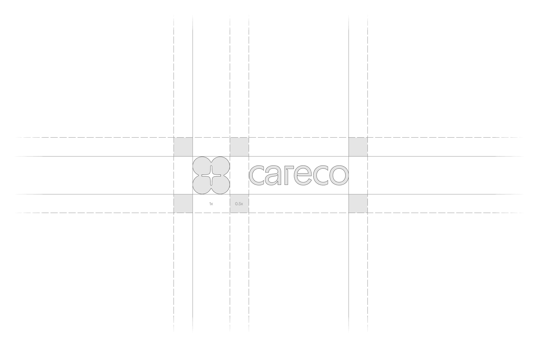
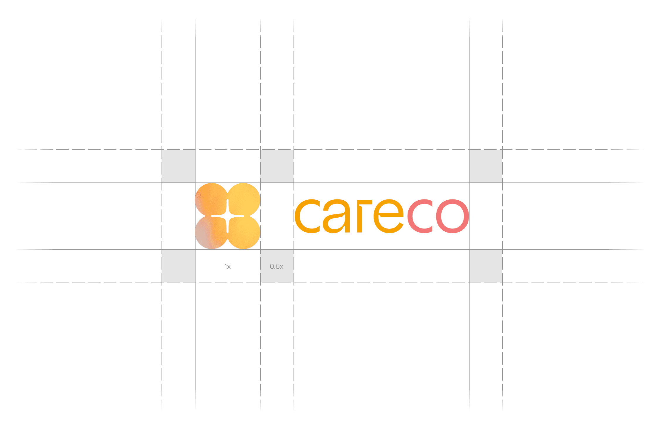
Client

Careco

Year

2024

Deliverable

Brand Design, Web Design, Art Direction

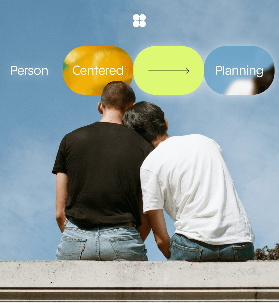
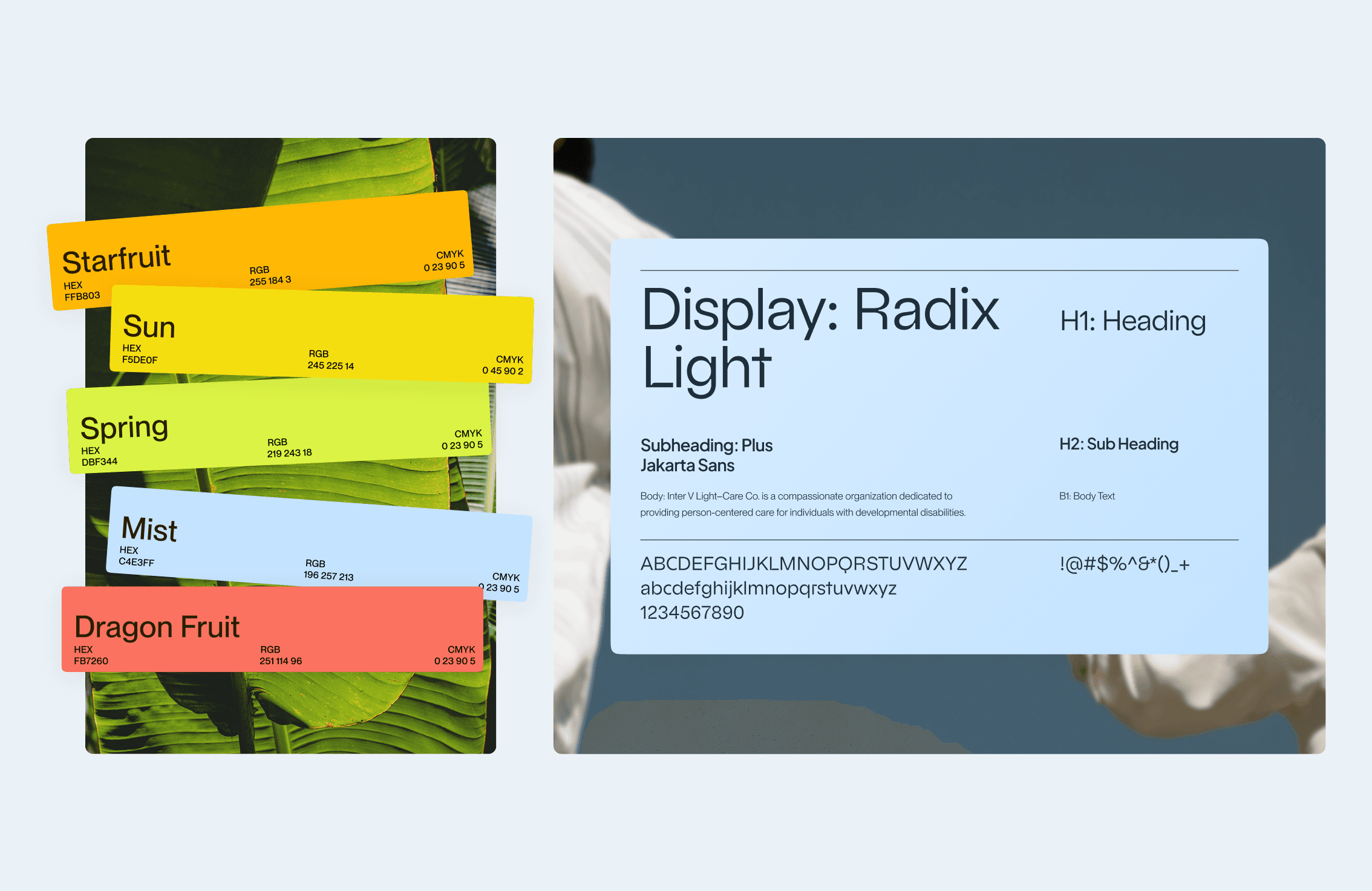
Careco provides person-centered support for individuals with developmental disabilities, guided by Filipino values of compassion, respect, and community. The challenge was to move away from the cold, clinical aesthetics typical of care organizations and build a brand that feels both professional and deeply human: structured yet warm.

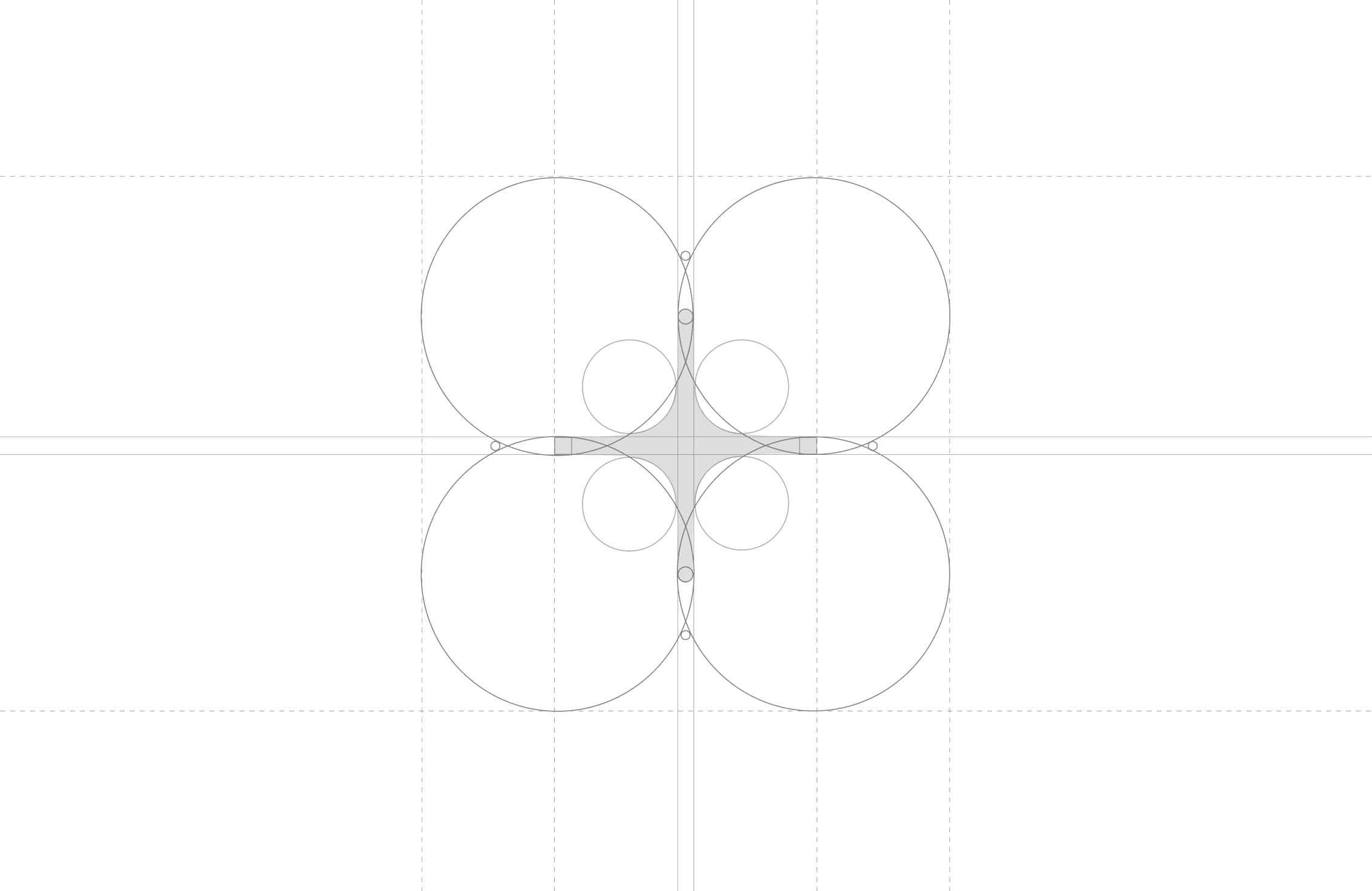
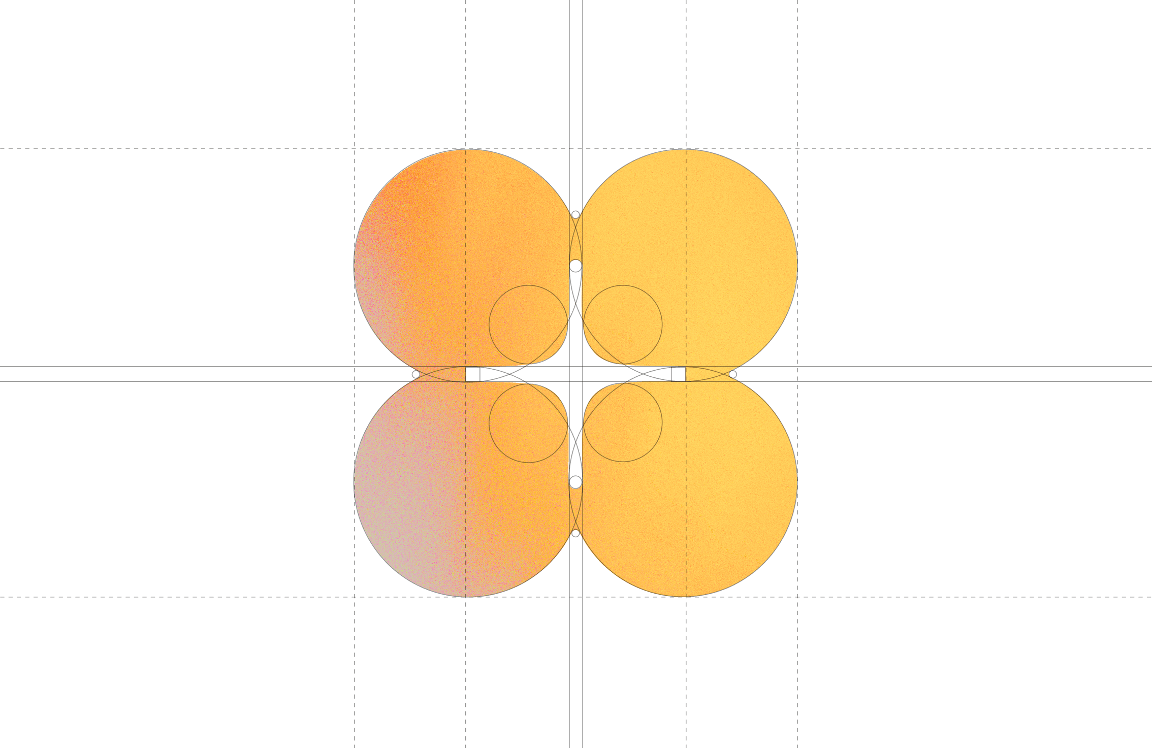
The identity system draws inspiration from Filipino culture’s sense of care and interconnectedness, using soft shapes, optimistic colors, and approachable typography. Every design decision reflects Careco’s philosophy of people first, always.


The Careco logo is built from the subtraction of four interconnected circles, forming a flower with four petals and a subtle star at its center; a symbol of connection, growth, and guidance. The geometry reflects the brand’s mission: person-centered planning rooted in community and shared care.

The Careco website translates the brand’s person-centered philosophy into a clear, accessible digital system. The design uses generous white space, rounded forms, and warm gradients to convey empathy and trust, subtly reflecting Filipino values of care and connection.

A structured grid, bold yet approachable typography, and high-contrast CTAs ensure usability and clarity. The result is a modern, strategic interface that communicates professionalism without losing human warmth.

The art direction rejects the sterile tropes of healthcare in favor of something alive, tactile, and human. Centered around the starfruit, a symbol of generosity and Filipino heritage, the imagery uses golden yellows, lush greens, and sky blues to evoke warmth and vitality. Natural light and tropical textures create a sense of openness and honesty that reflects the heart of person-centered care.

Every image captures genuine connection instead of performance. Touch, closeness, and sunlight replace clinical backdrops with emotion and trust. The result is a visual language that feels alive, cultural, and deeply human.

Credit

Tonan Ahn

(Lead Designer)

Josef Rapadas

(Project Manager)

Agustin Farias

(Photographer)

The Careco website translates the brand’s person-centered philosophy into a clear, accessible digital system. The design uses generous white space, rounded forms, and warm gradients to convey empathy and trust, subtly reflecting Filipino values of care and connection.

A structured grid, bold yet approachable typography, and high-contrast CTAs ensure usability and clarity. The result is a modern, strategic interface that communicates professionalism without losing human warmth.

Careco—Disability Care